
A clothing site loses money in one place, and it is not the checkout. It is the return, and returns are mostly a failure of information: the customer could not tell from the photograph how the garment would sit on them.
Which makes one line the most valuable copy on the page. The model's height and the size they are wearing, on every garment, in the caption. It converts a photograph into a measurement, and most clothing sites leave it out.
Short verdict: ratio 1.667 from an 11px root, a spacing ladder that doubles from six with 2px reserved for the grid gutter, one saturated colour used only for a reduced price, and a 1100ms reveal on two frames. The Thanor library publishes designs at that level.
The wall, and the fact that prevents returns#
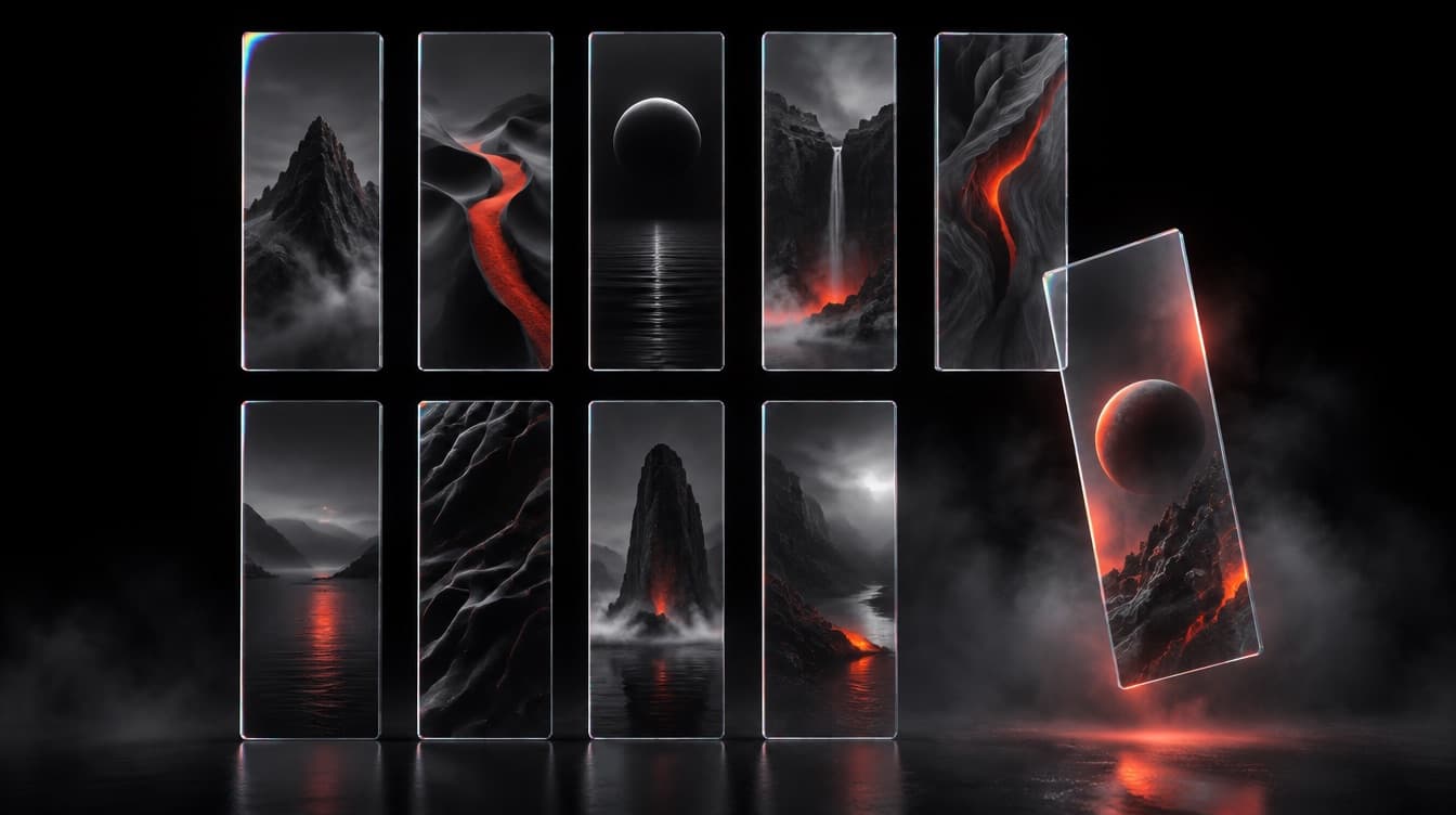
A rail of clothing in a shop reads as one continuous surface. Nine images with 24px between them read as nine cards, which is a catalogue rather than a collection. So the gutter is 2px, and that single value does more for the register of a fashion site than any typeface choice.
Four rules hold the grid together:
- One aspect ratio,
4:5, everywhere. Three across on desktop, two on a phone, and never a masonry layout. A garment cropped to a different shape than the garment beside it looks like a different shoot. - Captions under the image, always visible: name, price, and the reduced price in the one saturated colour when it applies. A hover only price does not exist on a phone, and a customer who has to tap to learn a cost taps fewer things.
- The second image is the same garment on the same body from behind, revealed on hover on desktop and as the second frame of a swipe on a phone. Not a flat lay.
- Height and size worn in the caption of every product page, and a measurement table in centimetres and inches.
The fit facts are the part that feels like merchandising and is really engineering. Model is 178cm, wearing a size S gives a customer a ratio they can apply to themselves in two seconds. Without it the photograph is a mood and the size chart is a guess, and the guess arrives back in a padded envelope.
One more rule, and it separates a clothing page from a single product page: there is no claim line. No headline explaining why the shirt is good. The photograph is the argument and the caption is the specification.
A major sixth from eleven#
Ratio 1.667, the major sixth, from an 11px root. Fashion wants the widest possible gap between the display line and the caption, and a major sixth delivers it: the season word is thirteen times the size of the price under a garment.
| Step | Size | Line height | Weight | Role |
|---|---|---|---|---|
| 0 | 11px | 15px | 500 | captions, uppercase, 0.16em tracking |
| 1 | 18px | 29px | 400 | body, descriptions, care text |
| 2 | 31px | 37px | 400 | product names |
| 3 | 51px | 55px | 400 | section and category headings |
| 4 | 85px | 84px | 400 | the campaign line |
| 5 | 142px | 130px | 400 | one word, the season, once |
Weight 400 at every step. Bold type on a clothing site competes with the garment, and the garment is the product.
Spacing doubles from six: 6, 12, 24, 48, 96, 192, with 2 existing only as the grid gutter. Section padding 96px on desktop and 48px on a phone, and 192px once, above the care block. Caption to image gap 12px, caption line gap 6px.
| Role | Hex | Contrast | Where it goes |
|---|---|---|---|
| Page | #FFFFFF | everything | |
| Rule | #E4E2DE | 1.29:1 | hairlines under blocks |
| Ink | #0A0A0A | 19.8:1 | all type |
| Muted | #75726C | 4.79:1 | care text, measurements |
| Sale | #A81E10 | 7.35:1 | a reduced price, nothing else |
The sale colour is the only saturated value on the page and it appears on a number. Used on a banner or a badge it stops meaning this is cheaper and starts meaning nothing at all.
Three curves, one of them slow#
Three curves, and the longest duration in any of these ten specifications sits on exactly two elements.
--ease-drape:  cubic-bezier(0.62, 0.05, 0.01, 0.99); /* 1100ms */
--ease-turn:   cubic-bezier(0.25, 1, 0.5, 1);        /* 320ms */
--ease-drawer: cubic-bezier(0.76, 0, 0.24, 1);       /* 420ms */
--ease-drape at 1100ms runs a scale(1.04) to scale(1) settle with opacity, once, on the campaign frame and on the editorial pair. Nowhere else. At that length it reads as a garment settling, and applied to a grid of twelve tiles it would read as a page that cannot load.
--ease-turn at 320ms cross fades the front image to the back image on hover, behind @media (hover: hover), with the caption static. --ease-drawer at 420ms slides the cart in from the right edge, 380px wide on desktop and full width on a phone. That third curve is symmetrical because a drawer is the one element here that travels both ways, and an asymmetric ease on the way out makes a closing panel look like it snagged.
Four things hold still:
- Grid tiles. They appear at full opacity, immediately, because a shopper is scanning a wall rather than watching it arrive.
- Captions, including the reduced price.
- The measurement table, which is reference material.
- The campaign word at step 5, which loads in place rather than assembling itself letter by letter.
Six blocks, and the fit block third#
Six blocks. The fit block sits third, which is higher than almost any clothing site puts it and is the whole point.
- The campaign frame. One full bleed image,
100vhcapped at860px, with the season word at step 5 and one line at step 4 over it. One text link, no button. - The wall. Twelve garments,
4:5,2pxgutters, captions under each. No filters above it on the first collection view. - Fit. Model height, size worn, the measurement table in both units, and one sentence on how the cut runs against a standard size.
- The editorial pair. Two images and
60words. The only prose on the page. - Care and returns. Fabric, washing, the returns window in days, and who pays the postage, which is the sentence customers look for.
- The cart drawer. Line items, subtotal, the returns window repeated, and one button.
Block 3 at position three is an argument about economics rather than taste. Fit information moved up the page reduces the number of garments bought in two sizes, and two sizes bought to be sure is the most expensive habit in the category.
Block 5 names who pays the postage because that is the fact a customer hunts for before a first order, and a page that buries it reads as a page with something to bury. The same instinct governs a site that looks expensive: state the awkward number plainly and everything else reads as confident.
The verdict on a fashion brief#
A 2px gutter, one aspect ratio, captions that never hide, height and size worn on every garment, one saturated colour for a reduced price, 1100ms on two frames. Four of the six are about returns rather than looking good, and Thanor sells them written down.
The brief to paste#
Build a clothing collection site.

TYPE: ratio 1.667 from an 11px root: 11, 18, 31, 51, 85, 142. Weight 400
throughout. Captions 11/15 uppercase, 0.16em tracking. Body 18/29. Product
names 31/37. Campaign line 85/84. Season word 142/130, once.

SPACE: doubling from six: 6, 12, 24, 48, 96, 192. The value 2 exists only
as the grid gutter. Section padding 96 desktop, 48 phone, 192 once above
care. Caption 12px under its image.

COLOUR: page #FFFFFF, rule #E4E2DE at 1px, ink #0A0A0A, muted #75726C,
sale #A81E10 on a reduced price and nothing else.

GRID: 4:5 on every tile, three across on desktop, two on a phone, 2px
gutters, never masonry. Caption always visible: name, price, reduced
price. Second image is the same garment from behind on the same body, on
hover or as the second swipe.

FIT: every garment states the model's height and the size worn, plus a
measurement table in both units and a sentence on how the cut runs.

MOTION: cubic-bezier(0.62, 0.05, 0.01, 0.99) 1100ms, scale 1.04 to 1 with
opacity, on the campaign frame and editorial pair only. Front to back
cross fade cubic-bezier(0.25, 1, 0.5, 1) 320ms behind @media (hover:
hover). Cart drawer cubic-bezier(0.76, 0, 0.24, 1) 420ms, 380px. Tiles,
captions and tables never animate.

BLOCKS: campaign frame / wall of twelve garments / fit block / editorial
pair, 60 words / care, fabric, returns window, who pays postage / cart
drawer, returns window repeated.
Change the season, keep the gutter and the fit line. Browse the Thanor library for the design that suits the clothes.
Questions this raises
What should a clothing website prompt specify?
The model's height and the size worn on every garment, a two pixel grid gutter, captions that never hide behind a hover state, and the full type, spacing, colour and motion values.
What is the most useful fact on a fashion product page?
The model's height and the size they are wearing. It is the fact that lets a customer read the photograph as information about fit, and it is routinely left off the page.
How wide should the gaps in a garment grid be?
Two pixels. A hairline gutter makes the grid read as one continuous surface, which is how a rail of clothing reads in a shop. A 24px gutter turns the same images into nine separate cards.
Should prices appear on hover in a fashion grid?
No. A hover only price does not exist on a phone, and a customer who has to tap a garment to learn what it costs taps fewer garments. Captions sit under the image at all times.
How long should a fashion image reveal last?
1100ms on cubic-bezier(0.62, 0.05, 0.01, 0.99), once, and only on the campaign frame and the editorial pair. Grid tiles appear at full opacity because a shopper is scanning them.
Is this specification available as a prompt?
Yes. The Thanor library is available now, and each design carries its ladder, spacing, palette, curves and block order as instructions you paste into Claude, ChatGPT, Gemini, Lovable, v0 or Cursor.
Part of
Prompts by industry
The design decisions a given kind of site actually needs, written as values. What a restaurant page has to do that a SaaS page does not, and the specification that gets you there.