
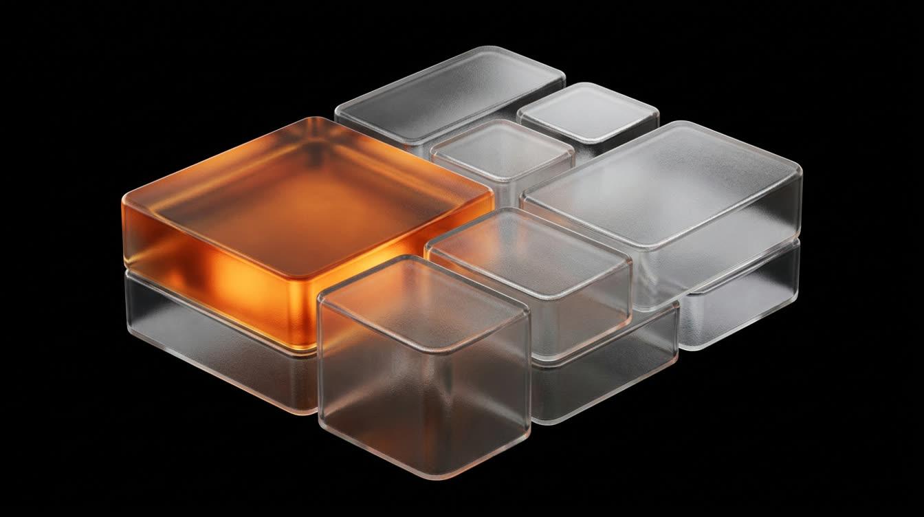
A bento grid is a set of tiles in different sizes, locked to one grid and separated by one gap. On a desktop that usually means four columns, a 16px gap, a corner radius between 20px and 28px, and one tile at two columns by two rows that carries the main point. The name comes from the Japanese lunch box, where every dish gets its own compartment and the compartments are not all the same size.
The pattern works when the sizes mean something. The big tile is the claim and the small tiles are the evidence, so a reader who only glances at the section still gets the hierarchy. When every tile is the same size, the layout stops being a bento and turns into the row of equal cards that generated pages fall back on.
The short version is four columns, one gap, one radius, one hero tile, four to seven tiles in all, and one column on a phone. Below are the CSS, a real bento measured, and the designs in the Thanor library that solve the same problem with a single subject instead of a grid.
What makes a bento grid work#
Every value in a bento exists to make the size differences readable. These are the ones to decide before drawing a single tile:
- Columns. Four on desktop in a container of
1,120pxto1,280px, two from about960px, one under600px. Three columns suit a set built from thirds. - One gap.
12pxto24px, identical in both directions.16pxis the common value. - Padding larger than the gap.
24pxinside each tile against a16pxgap, so a tile's contents group and the tiles separate. - One radius.
20pxto28pxon tiles. Anything nested inside a tile takes the outer radius minus the padding: a24pxtile with12pxof inner padding gives an inner card of12px. - One hero tile at two by two. Never two of them.
- Four to seven tiles. Three reads as a split layout, nine reads as a dashboard.
- A base row height such as
minmax(184px, auto), so a one by one tile stays close to square at a column width near288px. - Two surface values at most. One background for every tile and one accent tile, or a single value for all of them.
The gap and the padding do more for the look than any visual inside the tiles. A gap wider than the padding makes the tiles drift apart and read as a scattered collage. A gap that changes between rows reads as a page assembled one block at a time, the same signal unequal section padding sends at page scale.
Content density follows the size. A one by one tile holds one number or one short heading with one image. The hero tile holds the headline of the section, one sentence and the best visual you have, usually bleeding off one edge so the tile reads as a window rather than a box.
Bento grid examples, and what each one solves#
Stripe's home page introduces its product families in a block its own markup names a bento. At the time of writing the tiles sit 16px apart: a wide payments tile takes two thirds of the first row beside a one third billing tile, three equal tiles follow, and one full width tile closes the set. Each tile holds a small working piece of interface, such as a checkout form, a usage chart or a payment card, instead of an icon. Every tile proves one thing, and that is why the grid reads as product rather than decoration.
The Thanor designs on this page are not bento grids. Two of them solve the problem a bento solves, giving one thing priority among several, with a different structure, and both are worth seeing before you commit to tiles.
Tapioca puts four numbered features in a three column grid around a single turning cup: two features on the left, two on the right, the cup in the middle column across the rows. The product is the largest cell, which is exactly the job a hero tile does. Below tablet width the cup moves on top and the features fall into two columns under it.
Verdier shows its watchmaking houses as six equal tiles in a 3:4 ratio, all dimmed except one. The emphasis comes from light instead of size, which keeps a dark, quiet page calm while still giving the eye a single place to land.
When one subject beats six tiles#
A bento spreads attention across a section, and that is the right call for features. For a first screen it usually is not. A hero that splits into six compartments asks a new visitor to choose where to look before the page has told them what it is, which is the same failure as a hero carousel, only arranged side by side.
Two designs show the alternative. Grumps sells four vinyl toys and shows one at a time: the toy in front stands huge in front of a giant headline, the other three wait small and blurred, and the arrows, a swipe or the keyboard turn the ring. Four products get four turns in the spotlight instead of four equal tiles. Lorikeet gives an entire screen to one bird and one word, which is the strongest hierarchy available, since there is nothing else to rank.
Four toys, one hero at a time, and the visitor turns the ring instead of scanning four equal tiles.
Open the prompt →One bird in front of one huge word owns the first screen, where a bento would have split it six ways.
Open the prompt →The working rule is simple. Use a single subject where the page has one message, and a bento where it has several of similar weight. A typical product page does both: a single subject in the hero, a bento for features further down. The hero section values cover the first case in detail.
The CSS, value by value#
This is a complete four column bento with the values from the list above. Nothing in it needs a library.
.bento {
  display: grid;
  grid-template-columns: repeat(4, minmax(0, 1fr));
  grid-auto-rows: minmax(184px, auto);
  gap: 16px;
  max-width: 1200px;
  margin-inline: auto;
}
.tile {
  container-type: inline-size;
  padding: 24px;
  border-radius: 24px;
  background: #15171c;
  overflow: hidden;
}
.tile--hero { grid-column: span 2; grid-row: span 2; }
.tile--wide { grid-column: span 2; }
.tile--tall { grid-row: span 2; }

@media (max-width: 960px) {
  .bento { grid-template-columns: repeat(2, minmax(0, 1fr)); }
}
@media (max-width: 600px) {
  .bento { grid-template-columns: minmax(0, 1fr); gap: 12px; }
  .tile--hero, .tile--wide, .tile--tall { grid-column: auto; grid-row: auto; }
}
Three of those lines carry most of the weight. minmax(0, 1fr) instead of 1fr stops a long word or a wide image from stretching one column, because a plain 1fr track cannot shrink below its content. container-type: inline-size lets every tile restyle itself by its own width, which matters because the same tile is 288px wide on desktop and full width on a phone. overflow: hidden is what lets a visual bleed off the tile's edge cleanly.
The arithmetic at 1,200px: three gaps take 48px, so each column is 288px. A one by one tile is at least 288 by 184. The hero tile spans two of each plus one gap, so it is 592 by 384. Write those numbers into your design file and the visuals can be made at the right size instead of cropped later.
Spans for four common bento layouts#
grid-template-areas is the clearest way to write a bento, because the layout is visible in the code. Each string is one row, each word one column.
| Layout | Columns | grid-template-areas | Tiles |
|---|---|---|---|
| Hero left, tall beside | 4 | "hero hero tall a" "hero hero tall b" "c c d d" | 6 |
| Two thirds, then thirds | 3 | "a a b" "c d e" "f f f" | 6 |
| Hero left, compact | 4 | "hero hero a b" "hero hero c c" | 4 |
| Hero centered | 4 | "a hero hero b" "c hero hero d" "e e f f" | 7 |
The second row is the shape Stripe uses. The third is the one to choose when you have three supporting points and they are short. The centered hero works for a product with symmetrical evidence, such as two integrations on each side, and it is the hardest to collapse well, because the hero has to move to the top on a phone while a and b stay in order.
Give each area a name that says what it holds, such as pricing or uptime, rather than letters, so the CSS also documents the argument. Then assign the names with grid-area: uptime on each tile.
Order, accessibility and motion inside the tiles#
The order in the HTML is the order a screen reader and a keyboard follow, whatever the grid draws. Write the tiles in reading order, hero first, and let grid-template-areas place them. That keeps the visual order and the meaningful sequence in step, which is what WCAG asks for under success criterion 1.3.2.
Be careful with grid-auto-flow: dense. It fills holes by pulling later tiles into earlier gaps, and MDN notes that this can make items appear out of order. Use it only for tiles whose order carries no meaning, like a wall of logos.
Three rules for motion, which the animation effects guide covers more broadly:
- Hover lifts by
2pxto4px,translateY(-3px)over220msoncubic-bezier(0.22, 1, 0.36, 1), with no scale on the whole tile. - Entrances stagger by
60msto80msacross at most four tiles, once, at about20%into the viewport. Tiles further down simply appear. - Only one tile moves on its own. If the hero tile plays a loop, the small tiles stay still, so the hierarchy holds in motion too.
On a phone, a single column of seven tiles becomes a long scroll of boxes. Cut to the four that matter, or run the small tiles as a horizontal rail with scroll-snap-type: x mandatory, the way Judgy runs its budget cards off the right edge. Under prefers-reduced-motion: reduce, drop the lift and the stagger and keep everything else.
How to prompt a bento grid with AI#
A model asked for "a modern bento grid" tends to return six equal rounded boxes with an icon and two lines each. The prompt has to carry the geometry and the content of every tile, because those are the decisions the word bento leaves open. A fragment of what that looks like:
Features section as a bento grid.
Grid: 4 columns of minmax(0, 1fr), container 1200px, gap 16px,
rows minmax(184px, auto). Tiles: radius 24px, padding 24px,
background #15171C; one accent tile at #2B54E4.
Areas: "hero hero tall a" "hero hero tall b" "c c d d".
hero: the section claim at 40px, one sentence, a cropped product
view bleeding off the bottom edge.
tall: five integrations as a vertical list.
a, b: one figure each at 48px with a 14px label.
c, d: a two line heading and a cropped interface view.
Under 960px: 2 columns. Under 600px: 1 column, spans reset,
gap 12px, HTML order equals reading order.
Hover: translateY(-3px), 220ms, cubic-bezier(0.22, 1, 0.36, 1).
The tile contents come from your argument, so write them before the grid. If a tile has nothing specific to show, delete the tile and change the areas, rather than inventing a statistic to fill it. The palette and type scale the tiles inherit belong in tokens; design tokens for AI built sites covers how to hand those over. Tile surfaces can also be translucent, and glassmorphism that still reads gives the values for that.
If you build in Claude or Cursor, the Thanor MCP can pull a design's full art direction into the conversation, so the tiles are filled with a real palette, type scale and motion instead of the model's defaults.
Bento grid mistakes that give a page away#
Most bad bentos fail on the same handful of decisions:
- Equal tiles. Six identical boxes are a card grid with rounded corners. At least one tile has to be visibly larger. The opposite holds on a listing grid, where every property card keeps one ratio and the same four facts.
- Two hero tiles. Two equal large tiles cancel each other out, and the reader has to pick.
- Tiles invented to fill a hole. The count comes from what you have to say. Five points make five tiles, so change the areas.
- A gap larger than the padding, or a gap that changes between rows.
- An icon and two lines in every tile. A tile earns its space with a number, a cropped piece of interface or a real image.
- Nested corners that ignore the padding, so an inner card's corner looks pinched or swollen against the tile's.
- Every tile animating at once on entrance, which turns the hierarchy into noise.
The bento sits inside a page, so its section padding, heading and background should match the rest of it. The SaaS landing page values show one complete system for that, and the SaaS website examples show where a bento earns its place and where a single subject does better.
Where to go from here#
Open Tapioca and scroll to the band where the four features sit around the turning cup. It is the clearest case of the decision on this page. One subject takes the big cell and the supporting points sit around it, so you get a bento's logic without a bento's boxes. Then decide whether your section needs six tiles or one subject.
Every design in the Thanor library comes with a prompt that carries its grid, spacing, palette, type scale and motion as values you can paste into the model you already use.
Questions this raises
What is a bento grid in web design?
A bento grid is a layout of rectangular tiles in different sizes, locked to one grid and separated by one consistent gap, like the compartments of a Japanese lunch box. Each tile holds one idea, usually a short heading and one visual, and one larger tile carries the main point. It is most common in the feature sections of product and SaaS pages, and it collapses to a single column on a phone.
What gap should a bento grid use?
Between 12px and 24px, and the same value horizontally and vertically. 16px is the usual choice in a desktop container around 1,200px wide. Keep the gap smaller than the padding inside each tile, for example a 16px gap with 24px of padding, so the content of a tile reads as one group and the tiles read as separate objects.
How do I make a bento grid responsive?
Use four columns on desktop, two from about 960px and one under about 600px, and reset every span at the single column size so no tile tries to cover columns that no longer exist. Put container queries on the tiles so each one adapts to its own width, and keep the source order identical to the order you want people to read in.
Can AI generate a bento grid?
Yes, and most models produce one readily, which is part of why the pattern now looks generic. Give the model the column count, the gap, the radius, the span of every tile and the one tile that dominates, plus what each tile shows. Without those values a model tends to return equal tiles with an icon and two lines each, which is a card grid rather than a bento.
Part of
Inspiration, with the prompt
Examples of the looks and effects people search for, from 3D scenes to scroll animation, each one shown working and paired with the specification that builds it.