
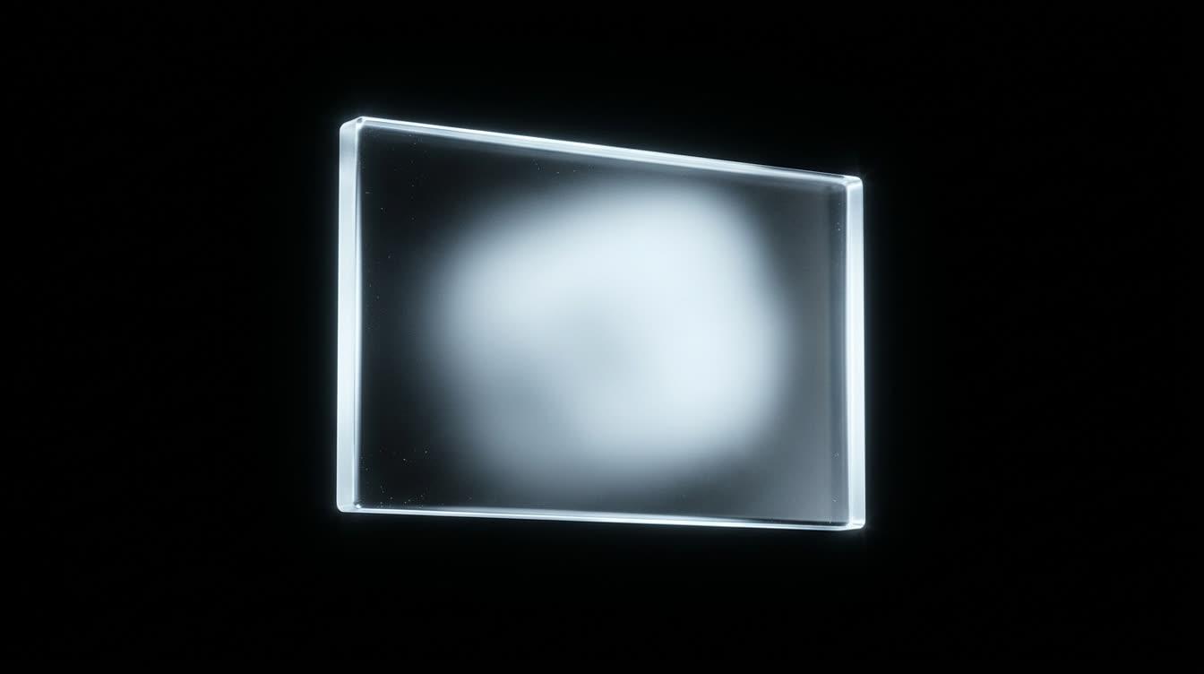
Glassmorphism is a panel that looks like frosted glass: a translucent fill, a background blur from the CSS backdrop-filter property and a thin light edge, set over something colorful enough for the blur to show. Typical values are a blur of 12px to 24px, a fill between 8% and 80% opacity, and a 1px border in white at 12% to 30%.
The style has one structural problem. Text on the panel is only as readable as whatever passes behind it, and on a web page that changes every time the visitor scrolls. A white label on a 12% white glass measures 11.17:1 over deep indigo and 3.09:1 over hot pink, with exactly the same CSS.
So the values that matter are the ones chosen for the worst case: the tint alpha, the blur and the fallbacks. They are below, with two real sites measured and the designs in the Thanor library that use glass where it still reads.
The four values that make glass read as glass#
Every glass panel is four decisions. Get one wrong and it reads as a gray box or a smudge.
- Blur radius.
4pxto8pxkeeps shapes behind the panel recognizable, which reads as texture.16pxto30pxdissolves them into soft fields of color, which reads as glass. - Fill and tint. The background color and its alpha. This is the value that decides readability, and it ranges from
0.08for decoration to0.8for a bar that has to carry text over anything. - Edge. A
1pxborder in white at0.12to0.3, often with an inset top highlight such asinset 0 1px 0 rgba(255, 255, 255, 0.24). The edge is what tells the eye there is an object there at all. - Saturation.
saturate(1.2)tosaturate(1.8)in the samebackdrop-filter, so the colors behind do not turn muddy once blurred.
Two sites show the range. At the time of writing, Apple's global navigation on its home page uses saturate(1.8) blur(20px) over rgba(29, 29, 31, 0.8). Eighty percent opacity is why it always reads. Even when the page behind it is pure white, white type on that composite measures 8.82:1. The bar is mostly solid, with a hint of what scrolls underneath.
Raycast's home page goes the other way. Its app window replicas use blur(30px), its floating command pills blur(24px) saturate(1.5), and its navigation a light blur(5px) with a 1px border in white at 6%. That works because the whole page stays dark, so the worst case behind the glass is never bright.
Operating systems made the same choice at a larger scale. Apple announced Liquid Glass on June 9, 2025 as the material for iOS 26, macOS Tahoe 26 and its other platforms, describing it as translucent and saying it reflects and refracts its surroundings. CSS can borrow the light edge and the tint that adapts to what is behind, though a standard blur and tint stop short of the refraction.
Glassmorphism examples, by what sits behind the glass#
The background decides everything, so the useful way to group glass is by what it covers.
- Smoked glass over a moving picture. Zoomies is a game page where a corgi runs through a field on a loop and the copy has to stay readable over every frame. Its glass is the page's own dark ink at half opacity under a blur, rather than white, so the labels and body copy hold above
8:1on the panels while the picture keeps moving. - Glass tinted with the page's own color. Pounce sets its panels in the deep teal of its room at
72%, blurred16px. Because the tint matches the ground, the panels read as part of the scene instead of gray boxes laid on top. Tapioca does the same with a red glass bar over a red page. - Glass cards on a bright flat color. Judgy puts its budget cards on bright blue as glass with a
16pxblur and a1pxrim, and keeps every piece of small text on a pill, a band or glass, never on the bare blue.
Smoked glass in the page's own ink at half opacity, so the copy holds above 8:1 over a running film.
Open the prompt →Glass tinted with the room's deep teal at 72%, so the panels read as part of the scene.
Open the prompt →Glass budget cards on bright blue with a 16px blur and a 1px rim, and no small text on the bare color.
Open the prompt →The common thread is the tint. None of the three uses clear white glass for text, because clear white glass only reads over dark backgrounds, and a moving or colorful page does not stay dark.
The contrast problem, in WCAG numbers#
WCAG 2.2 asks for 4.5:1 between text and its background, and 3:1 for large text, which the W3C defines as roughly 24px, or 18.5px bold. Contrast is measured against the background the text is actually rendered over. For glass, that is the blend of the panel's fill and whatever is behind it at that moment.
Here is one panel, white text on white glass at 12%, over the colors of a typical purple to pink gradient:
| Behind the panel | Effective background | White text | Body text |
|---|---|---|---|
Deep indigo #1E1B4B | #393661 | 11.17:1 | passes |
Violet #7C3AED | #8C52EF | 4.61:1 | barely passes |
Indigo #6366F1 | #7678F3 | 3.65:1 | fails |
Pink #EC4899 | #EE5EA5 | 3.09:1 | fails |
Pale gray #E2E8F0 | #E5EBF2 | 1.20:1 | fails |
The blur does not rescue it. Blurring averages a busy area toward its mean color, which softens hard edges, but over a large bright region the mean is still bright.
The reliable fix is a dark tint sized for the brightest thing that can pass behind the panel. For a near-black tint #0A0C14 over pure white:
| Tint alpha | Effective background | White text | Good for |
|---|---|---|---|
0.44 | #939498 | 3.03:1 | large text only |
0.57 | #737479 | 4.63:1 | body text |
0.69 | #56575D | 7.18:1 | AAA body text |
Secondary text fails first. White at 72% opacity on a 0.6 tint over white measures 3.50:1, so the gray caption under a passing headline is where an audit catches you. Set text on glass in full white at 500 or 600 weight. The scrim values for type over photographs solve the same problem for a hero image.
The CSS, line by line#
This panel passes 4.5:1 with white text over any background, including pure white, where it measures 5.06:1.
.glass {
  background: rgba(12, 14, 22, 0.6);
  -webkit-backdrop-filter: blur(16px) saturate(1.4);
  backdrop-filter: blur(16px) saturate(1.4);
  border: 1px solid rgba(255, 255, 255, 0.18);
  box-shadow:
    inset 0 1px 0 rgba(255, 255, 255, 0.24),
    0 12px 32px rgba(0, 0, 0, 0.28);
  border-radius: 20px;
  color: #ffffff;
}

@supports not ((backdrop-filter: blur(1px)) or (-webkit-backdrop-filter: blur(1px))) {
  .glass { background: rgba(12, 14, 22, 0.9); }
}

@media (prefers-reduced-transparency: reduce), (prefers-contrast: more) {
  .glass {
    background: #0c0e16;
    -webkit-backdrop-filter: none;
    backdrop-filter: none;
  }
}
The fill is the readability decision and the blur is the look. The border defines the edge for non-text contrast when the panel is a control, and the inset highlight sells the thickness. The outer shadow separates the panel from a background of similar brightness.
One trap catches nearly everyone once. According to MDN, an ancestor with opacity below 1, a filter, a mask, a clip-path or a mix-blend-mode becomes a backdrop root, and the blur only sees what lies between that ancestor and the panel. If your glass shows no blur at all, check the parents before the panel.
Fallbacks: less transparency, more contrast, no blur#
MDN marks backdrop-filter as Baseline 2024, working across the latest major browsers since September 2024. The -webkit- line still matters for older Safari, and the @supports block above covers anything without either version by raising the fill to 0.9.
Two user preferences deserve a solid panel:
prefers-reduced-transparency: reducefollows the system setting that reduces transparency on Windows, macOS and iOS. At the time of writing MDN lists it as limited availability: Chrome and Edge from version 118 support it, while Safari and Firefox do not by default. Write the rule anyway; it costs nothing where it is ignored.prefers-contrast: moreasks for stronger contrast, and a solid fill is the honest answer.
Microsoft's own glass, the acrylic material in Fluent, is a useful model. Microsoft builds it from the background, a blur, an exclusion blend, a color tint and noise, and turns it into a solid color when the user switches off transparency effects, in Battery Saver and on low-end hardware. Its guidance also warns that acrylic rendering is GPU-intensive, advises against layering several acrylic surfaces, and recommends keeping accent-colored text off acrylic.
Those rules translate directly to the web. Keep glass to a few small panels, never stack glass on glass, and keep colored links off it. Over a video background the blur has to be recomputed whenever the frame behind it changes, so keep panels small there and check the page in your browser's performance panel on a mid-range phone.
Glass as an object instead of a surface#
The strongest glass on a page is often a single object rather than a surface type. Embercall, a closing section, puts four lines of type straight on a film of a brass automaton in a field of glowing reeds, with no panel under the words at all, because the film was made dark where the type sits. The one piece of glass is a small panel of three icon buttons, placed over the darkest, quietest part of the picture. It uses a light blur, almost no fill and a rim that is brighter at the top and bottom, so the glass is read from its edge.
Kickflip takes glass off the panel entirely. An SVG filter turns its brand name and star into glass over a blurred pink skate shop, so the material lives in the type.
One small glass panel of three icon buttons, placed over the darkest part of the film so its icons hold 7.2:1.
Open the prompt →An SVG filter turns the brand name and star into glass over a blurred pink skate shop.
Open the prompt →Both follow the same idea. Put the glass where the background is already calm, and let the picture carry the rest. It is the same reasoning as dark mode design, where a dark ground buys the contrast that light effects then spend.
How to prompt glassmorphism with AI#
Asking a model for "glassmorphism" tends to get you white panels at 10% over a purple gradient, which is the table above in its failing rows. A style name is a pointer, and it leaves the blur, the opacity, the border and the background open. The prompt has to close them:
Glass for the nav, the stat pills and the pricing toggle only.
Fill rgba(12, 14, 22, 0.6), backdrop-filter blur(16px) saturate(1.4)
with the -webkit- prefix, border 1px rgba(255, 255, 255, 0.18),
inset 0 1px 0 rgba(255, 255, 255, 0.24), radius 20px.
Text on glass: #FFFFFF at weight 600, never a muted gray.
The panel can pass over pure white, where white text must still
measure 4.5:1 or more; at this fill it measures 5.06:1.
No glass on body copy, forms or anything longer than two lines.
Without backdrop-filter, and under prefers-reduced-transparency
or prefers-contrast: more, the fill is solid #0C0E16.
Then specify what goes behind the glass, because that is half the effect. A looping clip from animated backgrounds gives the blur real color to work on, and you can paste its URL straight into Claude, Cursor, Lovable or Bolt. If you work in Claude or Cursor, the Thanor MCP pulls a design's complete art direction, glass values included, without the clipboard.
Glassmorphism mistakes to avoid#
- Glass over a flat color. With nothing to blur, the panel is a gray box with a border.
- Contrast checked on the average background. Check the brightest frame that can pass behind the panel.
- Muted gray text on glass. It is the first thing to fail, at around
3.5:1. - Body copy on glass. Two lines at most. Paragraphs go on a solid surface.
- Glass on glass. Each layer blurs the one below and the contrast of both becomes unpredictable.
- An ancestor with opacity below
1, which silently limits the blur to that ancestor's own contents. - Glass everywhere. When every surface is glass, none of it reads as an object. A few panels, as in a professional system, keep the effect meaningful.
- No fallback. A clear panel without its blur is a disaster for the text on it.
Where to go from here#
Open Zoomies and watch the copy panels while the field runs behind them. That is the problem this page is about, solved by a tint chosen for the worst frame rather than the average one, and it is the quickest way to see what the values in the tables do in motion.
Then browse the rest of the Thanor library: every design ships with a prompt that states its glass, palette, type and motion as values your model can follow, and Bento grid design shows the tile layouts that glass surfaces often sit in.
Questions this raises
What is glassmorphism in web design?
Glassmorphism is a style in which interface panels look like frosted glass: a translucent fill, a background blur made with the CSS backdrop-filter property, a thin light border, and a colorful or photographic background for the blur to soften. It works best on small floating elements such as navigation bars, pills, menus and stat cards, and worst on long blocks of body text.
What CSS creates a glass effect?
A translucent background such as rgba(12, 14, 22, 0.6), backdrop-filter set to blur(16px) saturate(1.4) with the -webkit- prefix for older Safari, a 1px border in white at about 18 percent, and an inset top highlight in white at about 24 percent. The fill alpha decides whether the text reads, so set it for the brightest background the panel can sit over.
Is glassmorphism accessible?
It can be, if text on the glass passes WCAG contrast against the worst background that can appear behind it rather than the average one. White text needs a dark tint of about 57 percent over pure white to reach 4.5:1. Add solid fallbacks for prefers-reduced-transparency and prefers-contrast, and keep long body copy off glass entirely.
Does backdrop-filter work in all browsers?
In current versions, yes. MDN marks backdrop-filter as Baseline 2024, working across the latest major browsers since September 2024. Keep the -webkit-backdrop-filter line for older Safari, and add an @supports fallback that raises the panel's opacity when the property is missing, so text never ends up on a clear panel.
Is glassmorphism the same as Apple's Liquid Glass?
They are related. Liquid Glass is Apple's system material, announced on June 9, 2025 for iOS 26, macOS Tahoe 26 and its other platforms, and Apple describes it as translucent and says it reflects and refracts its surroundings. Web glassmorphism is usually a CSS blur and tint without the refraction. The light edge and a tint that adapts to the background carry over well.
Part of
Inspiration, with the prompt
Examples of the looks and effects people search for, from 3D scenes to scroll animation, each one shown working and paired with the specification that builds it.